Welcome to the Online Coverage Over Time deep dive article. Below, we cover:
Overview & Use Cases
How we Measure Online Coverage Over Time
How to add an Online Coverage Over Time Chart (Evaluation Widget)
The Online Coverage Over Time chart can be accessed via the Evaluation widget.
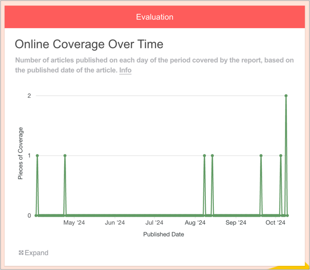
It shows the number of articles published on each day of the period covered by the report.
1. Overview & Use Cases
This chart presents the date on which each piece of online coverage was published.
Why Online Coverage Over Time is useful
PRs can use this chart to:
Identify spikes and troughs in coverage and relate them to key activities
Understand seasonality, or compare with expectations
Make more informed decisions going forward
Note that users can zoom in and out of the chart.
2. How we Measure Online Coverage Over Time
When a piece of coverage is added to the Online Coverage widget, we fetch the publish date. This chart visualises when each article was published, over time.

3. How to add an Online Coverage Over Time Chart (Evaluation Widget)
1. First, add some Online Coverage to your report
Drag on the Online Coverage widget and enter some URLs.
You can learn how to do this here.
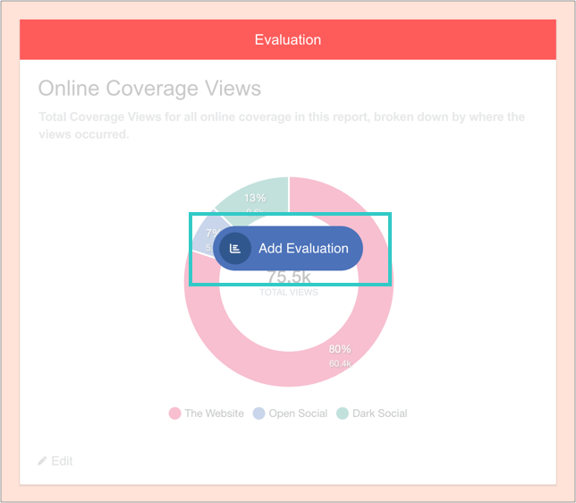
2. Add an Evaluation widget to your report
You can find this in the Toolbar.
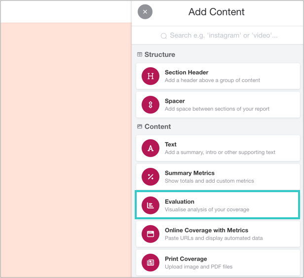
3. Click 'Add Evaluation'
And then 'Add charts':

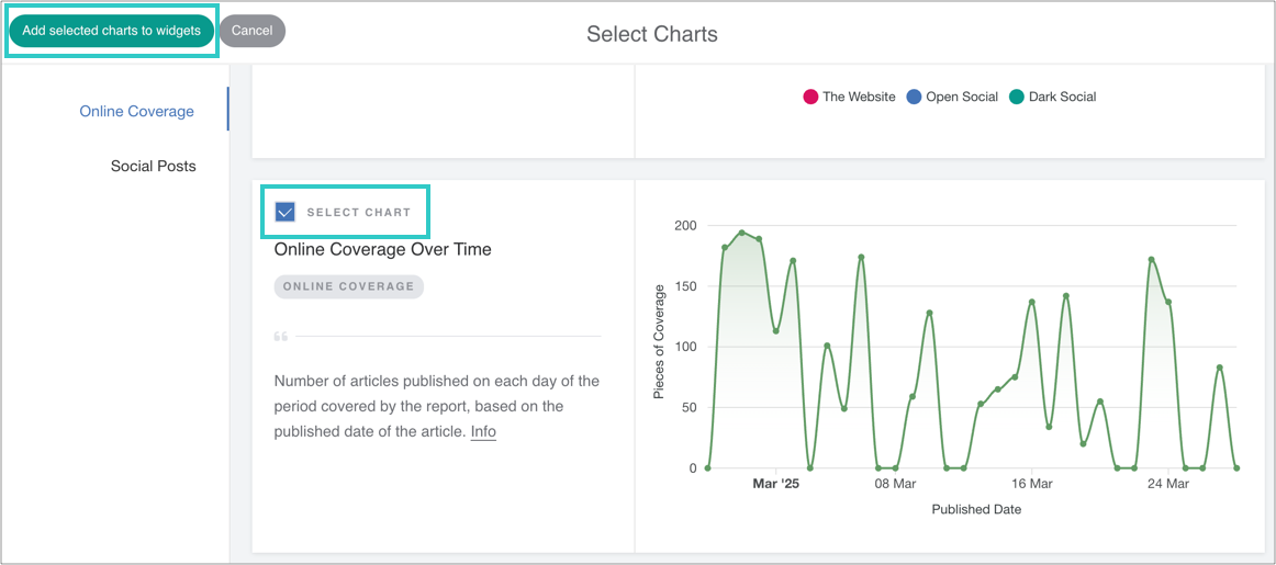
4. Select the chart, and then add it to the widget
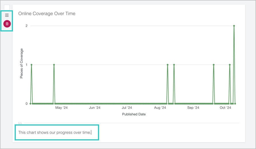
5. Optional: add a caption, reorder or delete the chart
6. Finally, click 'Done' to save the widget
The chart will automatically update as you add online coverage to the report.